New experiences next door
It's so easy to be trapped in a bubble, even within a bubble called "campus". NextUp puts all the fresh new events and experiences right at your fingertip, right when you need it.
We can all feel excluded sometimes.
Credit: 20PX
Overview
Like our society, our campus is often divided into cliques and circles. But often, other circles are welcoming and you just have to reach out.
NextUp is a social platform solely focused on enabling students to discover their campus, and seek out new experiences and connections. It's a prototype with a website and an iOS app, and a back-end to choreograph the show.
Goal
To help foster a healthy, diverse, and connected community. NextUp is another exploration of using technology to bring people together, and builds on top of what we learned from creating FoodSpot: tons of user research, ideation, and testing.
Concept
Since NextUp is an evolution on my previous FoodSpot project, I started the new project with a good friend and a few key learnings in mind. Here are some of the questions we tried to answer:
- Can we expand the application to cover all social events on campus, not just food-serving talks?
- Free food encourages people to check for events, but what's in it for the organizers to post their events?
- How do we make this available to everyone with whatever device they might use?
Tailored for event organizers
The core challenge of creating a platform for people to share is to not only promote consumption, but also encourage contribution. NextUp differs fundamentally from FoodSpot by focusing on a value system that incentivizes adding events for others to see.
List View
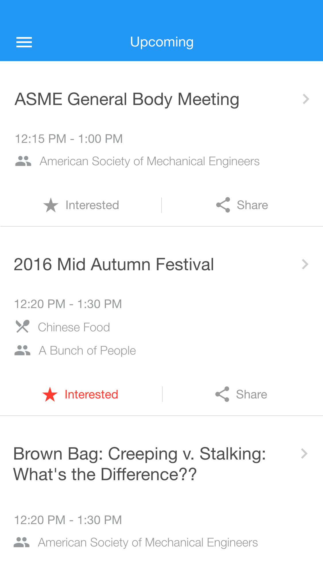
Sometimes the best solution is the most obvious one. After experimenting with map views for event discovery, we realized that it's much easier for people to simply browse an intelligently compiled feed.
Web + Mobile
To let every student freely access our product, I started the design with adaptive behavior in mind, so it scales to screens large and small alike. Both a website and an iOS app are created for their unique advantages: website allows universal access, while the app enables advanced features such as geofencing and notifications.
Instant Posters
My research has shown that even though students are digital natives, posters continue to be the centerpiece of outreach efforts. Designing a good poster can be hard, and remembering the details after seeing one isn't easy. That's why NextUp allows the organizer to pick a nice design, so viewers can scan the QR code to save and share the event in an instant.
Making an Ecosystem
Upon synthesizing previous research findings, we realized that to foster discovering events, we must help share events in the first place. Only by building a complete solution that makes life better for event organizers and participants alike can we deliver a win-win solution that everyone wants to use.
Creating an event
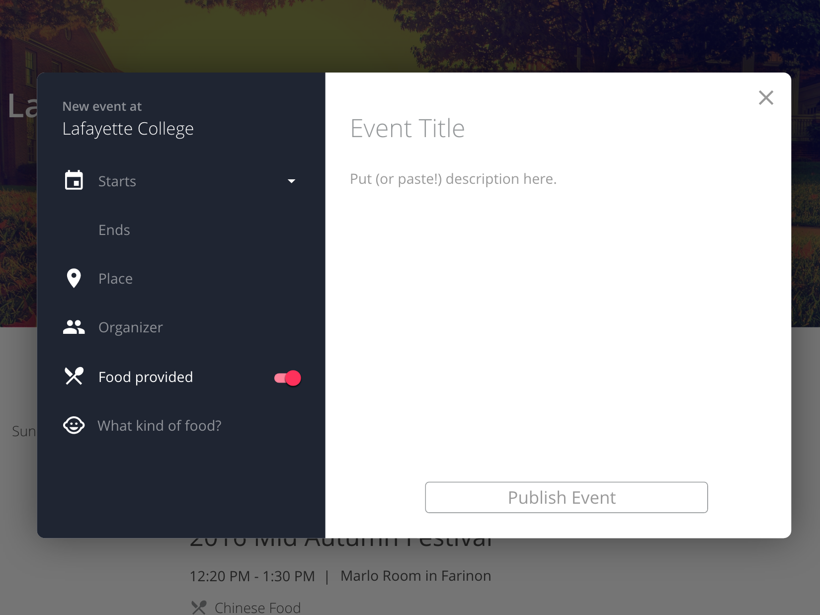
Observation revealed that many student and faculty members who organize events often use their laptops and library desktops to draft event emails and posters. So we made creating an event on the web a breeze, and encourage people to simply paste their event announcement email as the description, or vice versa.
Creating an event on NextUp is designed to be a one-stop experience, giving you the event for web and mobile, announcement email, social media sharing, and poster printing options all in one go.
Sharing an event
Friends make everything better, and both interviews and our own experience told us that we should make bringing friends along to a cool event as easy as possible. So we built simple workflows for people to share events in their feed, or from a poster they scanned, to others, and even pass the invitations on for a viral spread effect.
Design & Prototyping
For my first real-life adaptive design, I incorporated my learnings from the Interaction Design courses I'd recently taken.
Home Page
The home page is beautiful, clear, and welcoming. By design, it would integrate with school single sign-on systems so when you pull it up in your browser, you're already logged in.
Paste and go
The simple act of adding a new event has been considered and refined over and over. The result is a clean UI that still shows all the info you need. As you fill out the form, fields auto-populate with defaults that most wouldn't need to change, and the most complicated part (the event description) even tells you to paste your email in.
Microinteractions
The website not only looks sharp, but also flows gracefully. Smooth animations are delightful but never overwhelming. In fact, to craft elements and animations specified by Google's Material Design guidelines, we chose to custom code our own. Because existing frameworks, even ones from Google itself, aren't good enough.
Mobile feed
Instead of a map interface used in FoodSpot, NextUp offers up a minimalist list listing minimal details. As usual, the simplicity is the result of many iterations in prototyping and testing. Although the UI feels spacious, it contains all the critical details, and puts important actions only 1 tap away.
Details, no image
We explored making it easy to add event images, but prioritized usability over form. Students often can't find relevant images, especially on a library PC, that's beautiful and free-to-use. Plus, many still live on limited-data and slow networks. Removing images makes it faster to both create and view events.
Flexible Implementation
By using the latest frameworks including React and Redux on the front-end, and by making a REST API with PostgreSQL and Go on the back-end, we leveraged existing, open source solutions that are both quick to prototype and easy to extend in the future.
Lesson Learned
Product alone isn't enough
From the start, the project was meant to be a concept for us to apply our knowledge and gain hands-on experience building a cross-platform service. But it became clear to us during the process that this would've made an excellent product and may actually be a market success.
However, in trying to recruit people for testing, I saw how crucial a good go-to-market plan really is. Between my full-time job and my various side projects, I chose not to prioritize this project and take it all the way through due to the monetary and time investments required.
I had learned to find a need, refine an idea, and even build a functional product, but it turns out there is more to bringing that vision to reality. Product alone isn't enough, and now it's time to learn about the next step: marketing.
Why This Matters
On my journey to collect tools for my toolbox, NextUp brought a few important elements: flexible roadmaps, cross-platform frameworks, adaptive design, and the idea to think through the process cycle instead of a use case in isolation.
A fitting sequel to FoodSpot, NextUp brings me one step forward on my path to connect people and inspire communities so we can solve big challenges together.


